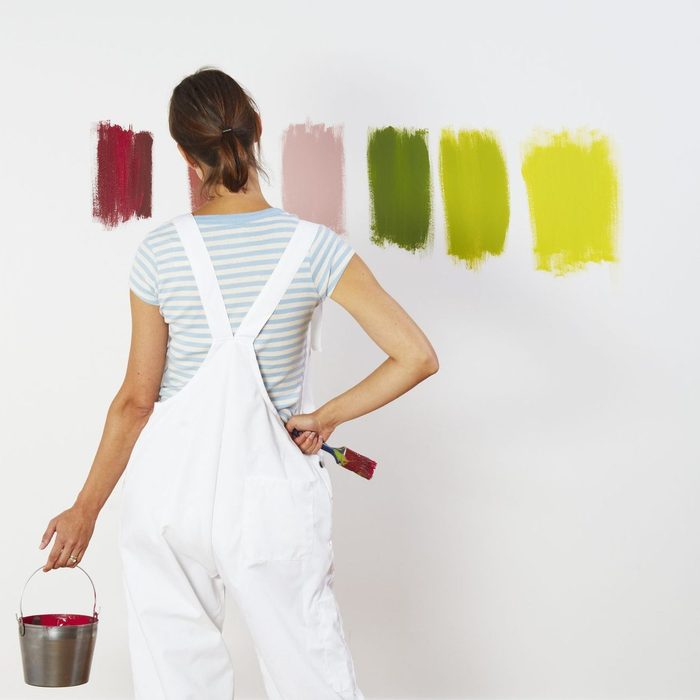
Finding the Right Color
Picking out the perfect color for each room of the house can be challenging, especially since this anchor color sets the tone for the rest of the room. That’s why we interviewed Sara Barney from Austin-based BANDD Design and Amy Carman, Sarah Kick and MacKenzie Pankey from Milwaukee-based Amy Carman Designs to give us their expert advice.
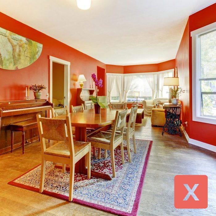
Classic Red
Sara, Amy, Sarah and MacKenzie all mentioned red as a color to avoid. Classic reds can be off-putting or unsettling, especially in bedrooms or living rooms where you want to unwind after a long day.
Even the Property Brothers agree with them. On an episode of their popular home improvement show, Property Brothers: Buying and Selling, the duo—Jonathan and Drew Scott—noted that there are two colors that should never be used to paint interior walls: red and yellow.

Bright Yellow
All of our interviewed experts agree that yellow is a no-go. Bright yellow is a distracting color and can take away from the rest of the room. Most yellow shades can make the room look dingy as well. That’s why Sara Barney also recommends avoiding yellow-toned whites.
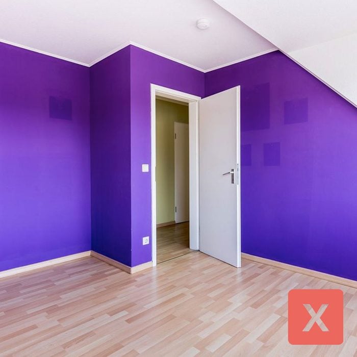
Saturated Purple
You may see a theme here: Saturated colors don’t spark joy as a paint color. That’s why Amy Carman’s experts put purple at the top of their skip list. The team expands, “While these colors work well in artwork or accent pillows, we have found that on walls these tones tend to be more limiting and may not last the test of time.”
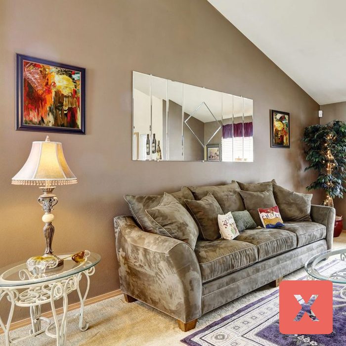
Builder’s Beige
While you should put the paintbrush down for blindingly-bright colors, Sara Barney reminds us that not every neutral is created equal. Builder’s beige in particular can give off a dirty cast. Be sure to avoid yellowy or greenish beige or khaki, which don’t cast anyone in a flattering light.
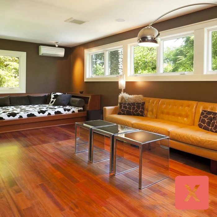
Traditional Brown
Brown is the other neutral color that Sara Barney recommends to stay away from. Darker brown shades can make the room feel small whereas lighter brown shades may make the walls look dirty.
Here are some other paint colors that can make your walls look dirty.
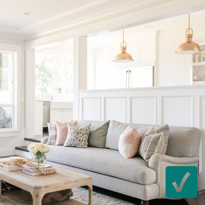
White
While you should avoid yellowy whites, there are plenty of other shades that both design firms suggest. The Amy Carman team recommends White Heron that’s crisp in color without being clinical: “This is one of our go-to paint colors for ceilings and trim work.” Whereas Sara Barney suggests Morristown Cream and Chantilly Lace. She expands, “They’re amazing for the individuals who want a color that isn’t your typical off-white.”
Neutral whites are also on Joanna Gaines’ favorite paint colors list.
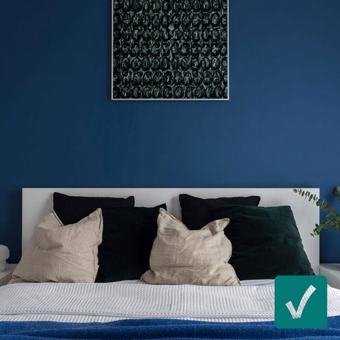
Deep Navy
Want something a little deeper and bolder? The folks at Amy Carman recommend classy, sophisticated Hale Navy. “For a timeless pop of color on walls and cabinetry, we love Hale Navy.”
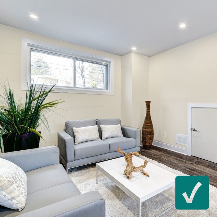
Taupe
Amy Carman’s team can’t get over muted taupes and grays, especially Classic Gray by Benjamin Moore. It’s a great soft, neutral option for homeowners. Here’s their take: “Paired with a light trim, this paint adds contrast to your walls while keeping the space light and bright.”
Classic grays also make for a beautiful front door paint color.
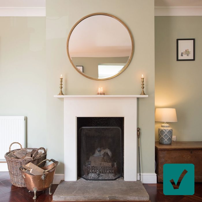
Light Sage
For something classic yet unexpected, Sara Barney suggests a light sage-like color. Her favorite is October Mist. Benjamin Moore even named it as its 2022 Color of the Year. (And with a description of “evocative of the stem of a flower, this gently shaded sage anchors and uplifts”…what could you not love?) She recommends covering your living room walls with this shade.
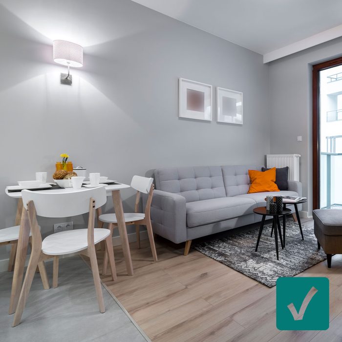
Stone Gray
Sara Barney coins herself as a “big fan of making a home feel cozy” and that’s why she leans towards warmer tones. Purbeck Stone and Ammonite both toe the line between modern and homey. She recommends these options for those who want a more traditional color.
Up Next: The Property Brothers Shared Paint Colors That Will Never Go Out of Style
